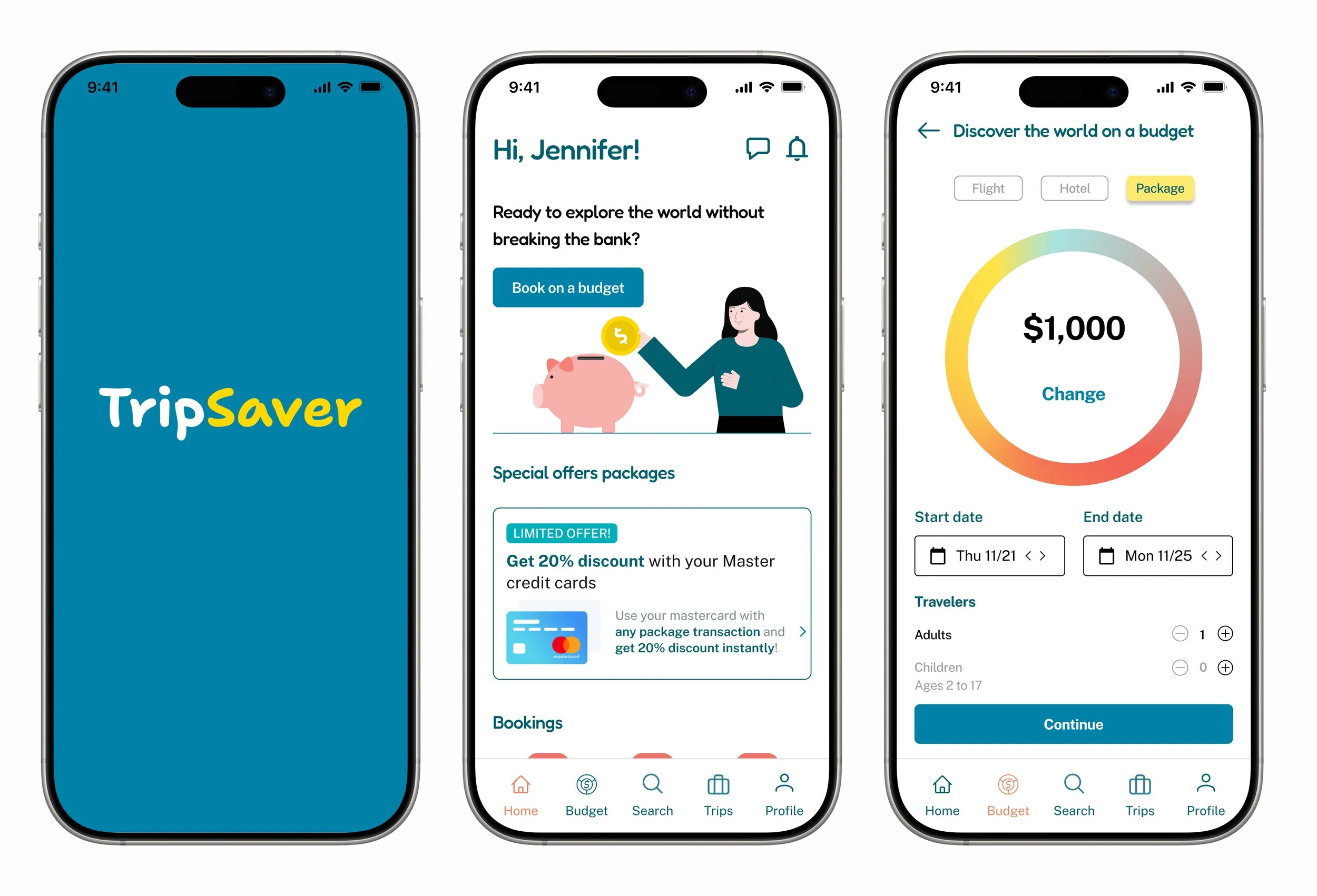
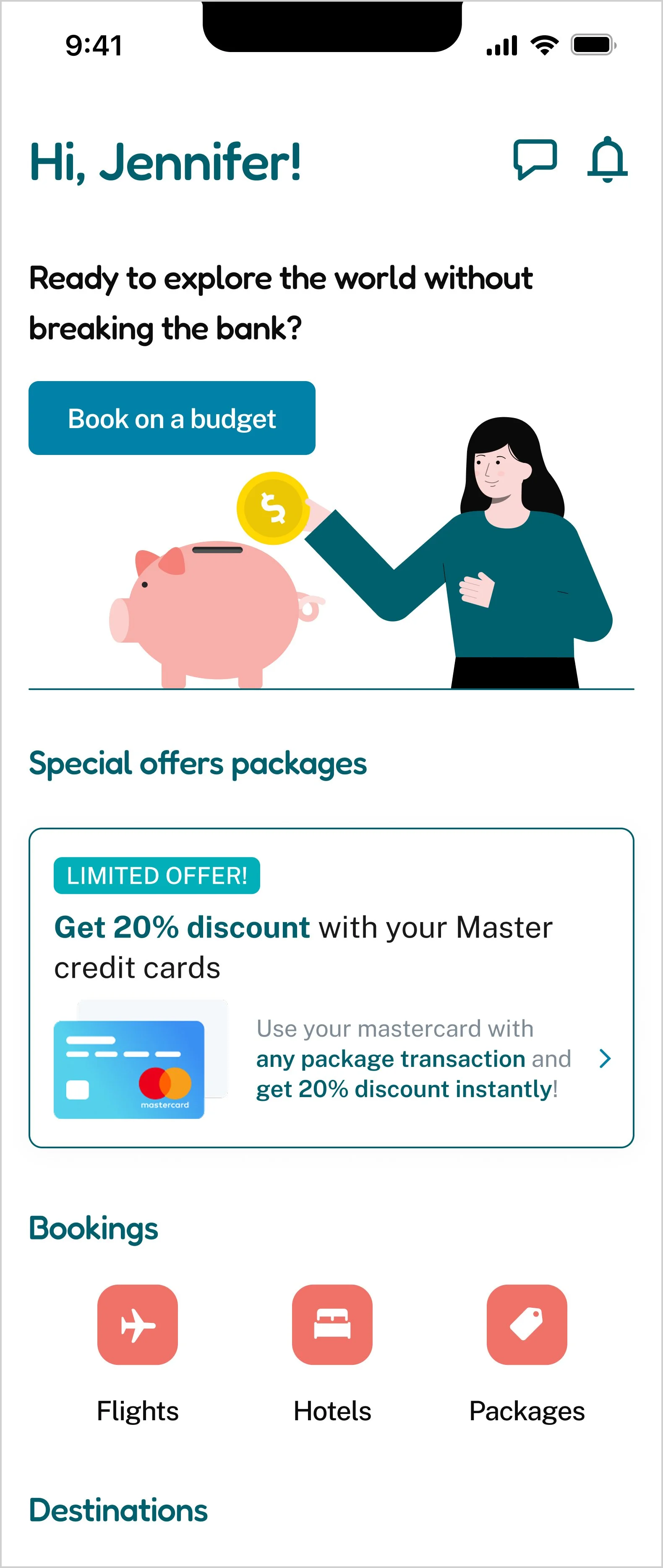
Budget Meets Adventure: Creating the Tripsaver App Experience
A travel booking app that helps users find trips within their budget.
The Problem
Traditional travel booking platforms often provide a wide range of options but do not help users stay within their budget. Many travelers struggle to balance the cost of flights, accommodations trying to have a memorable vacation experience. This leads to either overspending or the inability to fully plan their trip due to budget constraints.
Competitor Analysis - Understanding the Travel App Landscape
To inform the design direction for TripSaver, I conducted a competitive analysis of three major travel platforms: Booking, Expedia, and TripAdvisor. The goal was to identify common patterns, strengths, weaknesses, and unmet user needs across the market.
Key Findings
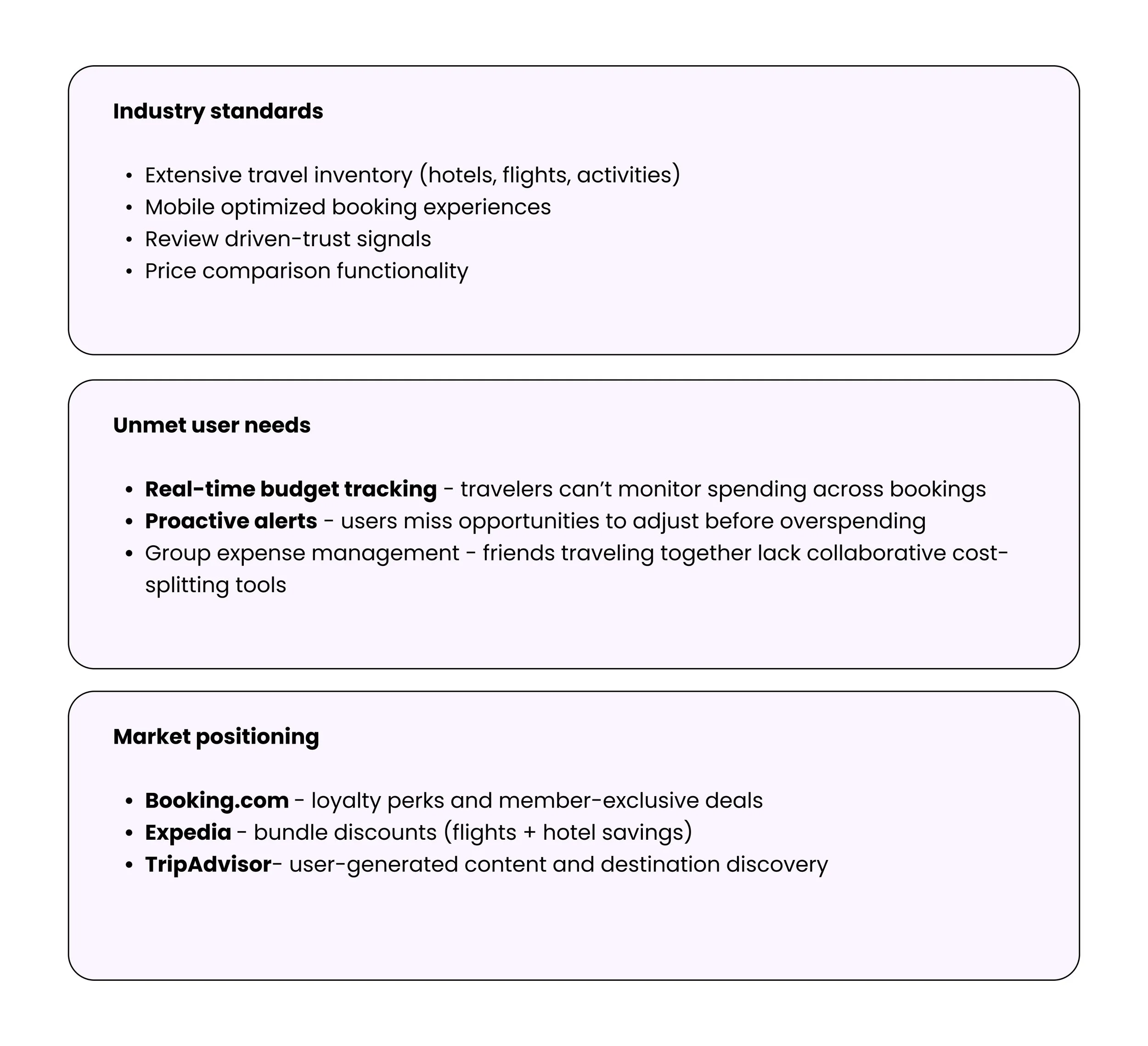
Opportunities Identified
Based on this analysis, several opportunities emerged for TripSaver:
Simplified comparison instead of dense filter systems
Context-aware recommendations dense filter systems
A more guided, insight-driven experience rather than raw listings
Clearer prioritization of information to reduce cognitive load
User Research
To better understand user needs and behaviors, I conducted remote interviews with 5 target users such as budget-conscious travelers, young professionals, frequent travelers. Each participant was asked about their travel planning habits, challenges, and priorities when a booking a trip. Based on these interviews, I identified key pain points and opportunities, which were then used to inform the design of the TripSaver app.
-
Pain Points: Travelers may encounter surprise costs that aren’t accounted for, such as last-minute fees.
Current Behaviors: Travelers often adjust their budgets on the fly, but this may not be easily done in traditional apps.
Opportunity: A budgeting feature that adjusts based on actual spending, enabling users to be flexible while staying within overall budget constraints.
-
Pain Points: Overwhelming amount of information, difficulty in balancing quality and cost.
Current Behaviors: Users often compare multiple travel apps to find the best deals on accommodation, flights, or activities, but this can lead to decision fatigue.
Opportunity: A budgeting feature that helps users balance budget constraints with quality expectations, suggesting options that meet both price and quality requirements.
-
Pain Points: Many travel apps provide vague pricing details, making it hard for travelers to foresee the full cost of their trip, including taxes, service fees, or extra charges.
Current Behaviors: Frustration with hidden costs.
Opportunity: A cost estimator that projects the total trip cost, breaking down the expenses (flights, accommodations) to help users plan more accurately.
Key Findings
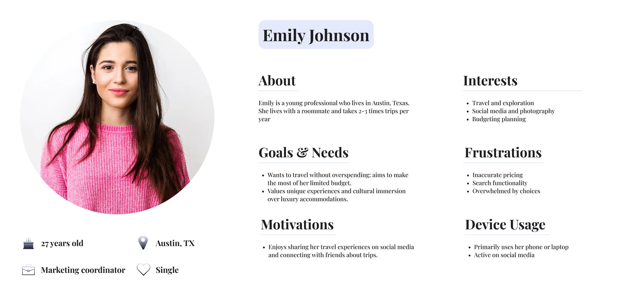
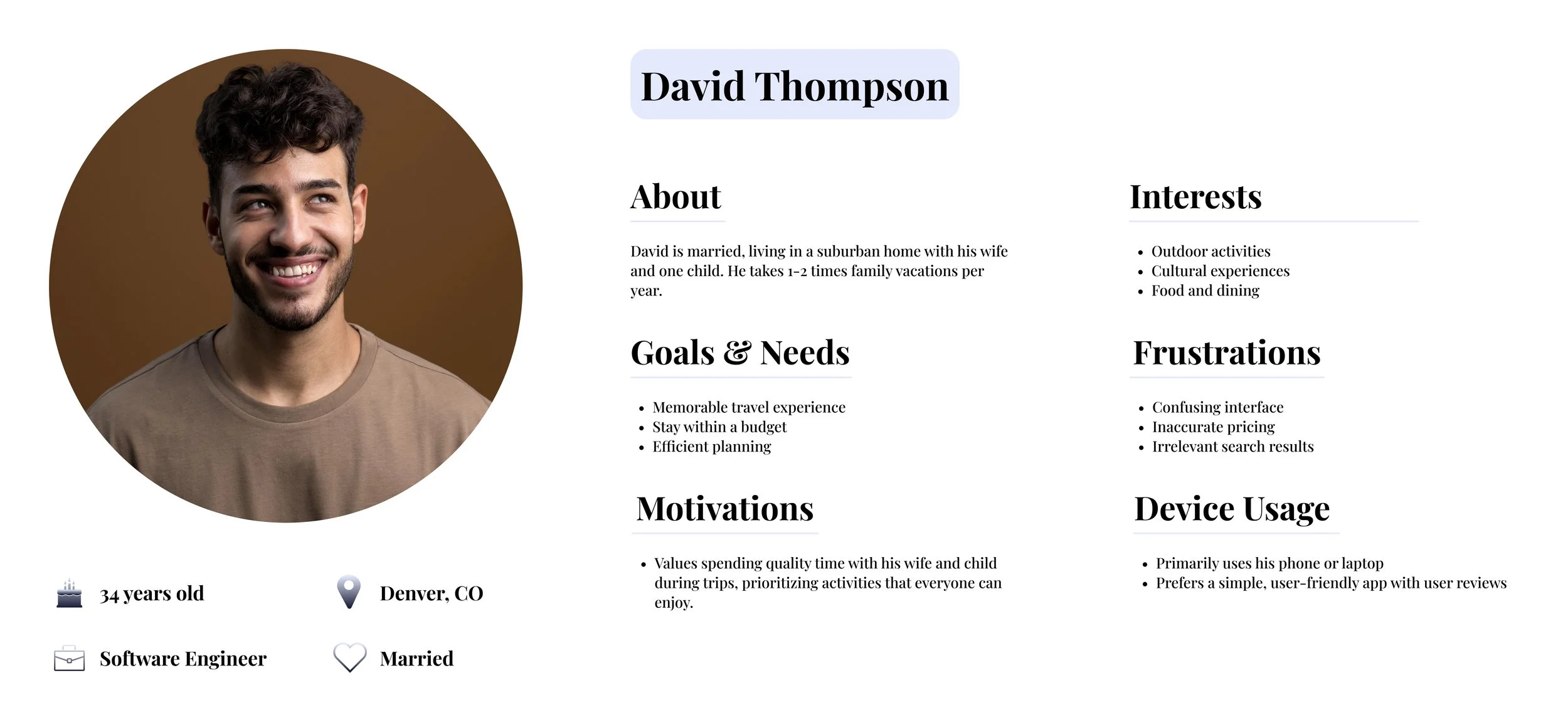
Personas & User Flow
User Personas
Two key personas to represent travel app users, highlighting different needs and priorities in relation to budgeting, trip planning, and the overall travel experience.
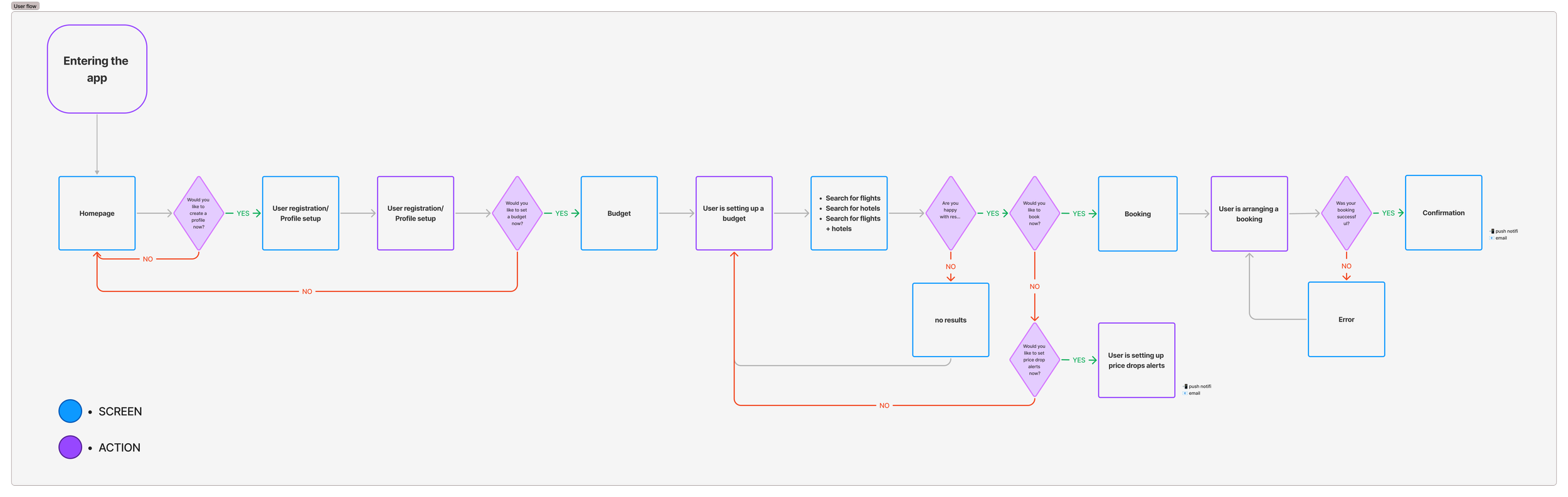
User Flow
Visualization of the steps users need to follow to complete key tasks, ensuring that the navigation was intuitive and seamless.
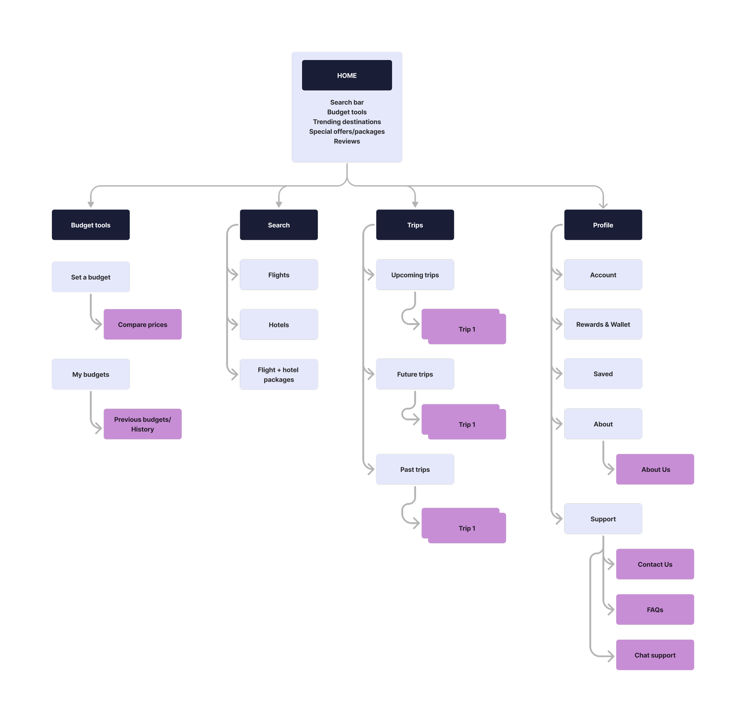
Navigation and Structure
Based on the information I created a sitemap. The sitemap helped visualize the relationship between different pages and features, ensuring a clear content hierarchy.
Visualizing the User Journey
This user journey map outlines the experience of using a travel budget booking app, from discovering the app to finalizing a booking. It highlights the user’s thoughts, actions, and emotions at each stage, revealing a shift from curiosity to cautious optimism and eventual relief. Key improvement areas include simplifying the process, offering clear value, and providing strong support to build trust and ease decision-making.

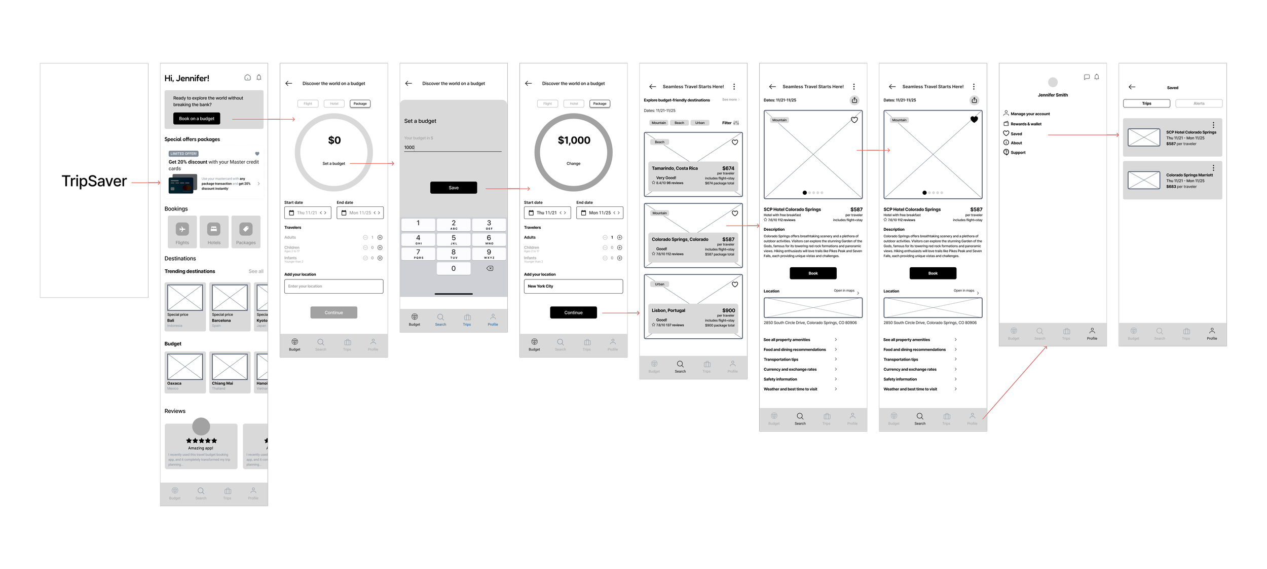
Idea Validation: Early Concept Exploration
I started by creating low-fidelity wireframes to focus on layout and functionality, without getting distracted by visual details. This helped me quickly map out key screens, such as the homepage, budget setup, and flow screens.
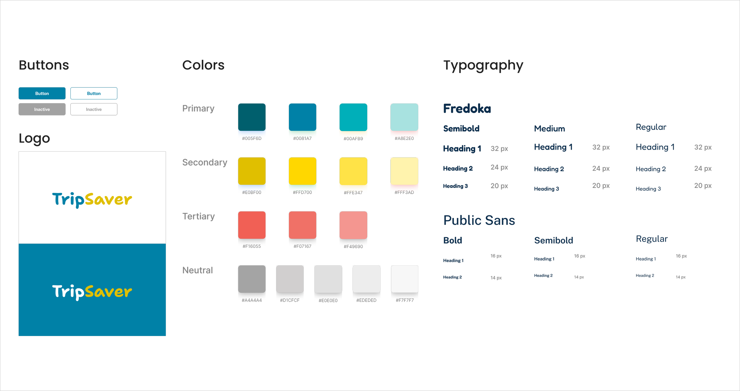
Branding
Сolors were thoughtfully chosen to reflect the brand's values and evoke the right emotions: blue for trust and reliability, yellow for happiness and excitement, and red for energy and enthusiasm.
I chose Fredoka for its soft, rounded shapes that create a friendly and approachable tone, ideal for engaging users in a welcoming way. To balance this, Public Sans brings a modern, clean, and highly legible style that adds professionalism and clarity to the overall design. Together, they offer a blend of warmth and trustworthiness.
Usability Test Insights
During usability testing, participants gave positive feedback on how intuitive the budget tracking feature felt. Many noted that seeing their budget update in real time made it easy to understand how each decision affected their overall trip cost.
Testers also expressed strong confidence in the variety of travel options provided. They appreciated being able to explore multiple destinations and combinations that all stayed within their chosen budget.
Overall user satisfaction with the app’s ease of navigation was high. Participants found the flow straightforward and felt they could move through the key steps - from setting a budget to reviewing trip details without confusion.
Positive User Feedback on the Intuitiveness of the Budget Tracking Feature
User Confidence in the Variety of Travel Options Provided
User Satisfaction with the App's Ease of Navigation
Design Iterations
Based on user testing, I made several UI iterations to refine the design, resulting in the final version.
The background was made clear, and the illustration colors were updated to match the app's color palette.

AFTER
BEFORE
The text size was increased, the CTA button was enlarged, and the information displayed was updated.
BEFORE
AFTER


Final Version
The final prototype showcases how user interactions have been improved through careful design decisions and intuitive navigation. This section visually highlights how the design effectively addresses user needs and delivers an enhanced experience.

Learnings and Opportunities
As a designer, I discovered the importance of creating intuitive interfaces that make complex features, like budgeting and destination suggestions, feel effortless to use. I also learned that users appreciate a clean, straightforward design that allows them to easily navigate and manage their travel plans without feeling overwhelmed.
Expanding the "Budget Destinations" feature with exclusive deals or partnerships could provide users with more affordable travel options. Introducing savings goals would boost user engagement. Other opportunities include adding multi-currency support, enabling social sharing, and integrating travel insurance—features that would increase the app's value and improve user retention.
Other Projects
NYC Pet Services
Responsive web design and redesign of an existing dog daycare website.

Instagram Events Feature
Adding an Instagram Events feature to improve event discovery.